
Muted spaghetti line charts with R's ggplot2

Martin is the host of martinfowler.com, the author of Refactoring, and the Chief Scientist at Thoughtworks.
12 April 2021
If someone tells me their sales last month was $10M - what do I make of it? With just the bare number, I don't know what to think. To make sense of the number I need context, perhaps over time, perhaps compared to compatible companies. Using a data visualization can help me put a number into a context that allows me to make sense of it.
One particularly useful form of context is context over time. How does today's figure match up with that value over time? A line chart, plotted against time, helps me see this.
Here is a rather more sombre example than sales revenues, the deaths per 100,000 due to covid in the state of Massachusetts.
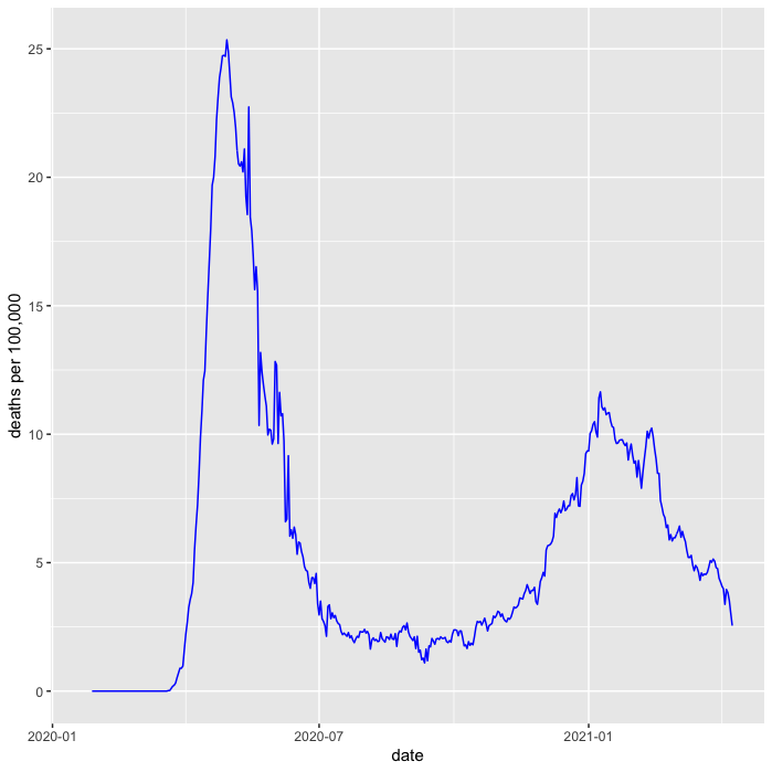
This is valuable, as I can now put today's figure in historical context, comparing recent figures to those in the last two peaks. It's also very easy to plot this chart in R, needing just a few lines of code.
death_pp %>%
    filter(state == "MA") %>%
    ggplot(aes(date, death_pm_rm)) +
    labs(y = "deaths per 100,000") +
    geom_line(color = "blue")
show code to load death_pp
# cdc covid data records New York City seperately from New York state
cdc_pops <- pops %>%
  mutate(pop = if_else(state == "NY", pop - 8400000, pop)) %>%
    add_row(name = "New York City", state = "NYC", pop = 8400000)

# http  -d "https://data.cdc.gov/api/views/9mfq-cb36/rows.csv" > cdc_cases.csv
cdc_cases <- read_csv("cdc_cases.csv") %>%
    select(state, submission_date, new_death, tot_death) %>%
    mutate(date = mdy(submission_date)) %>%
    arrange(date) %>%
    group_by(state)

death_pp <- cdc_cases %>%
  left_join(cdc_pops, by = "state") %>%
  drop_na(pop) %>%
  mutate(death_pm = new_death * 1000000 / pop) %>%
  mutate(death_pm_rm = rollmean(death_pm, 7, fill=NA, align="right"))
But I can show more context than just time. To better understand how the epidemic has been in Massachusetts, I can compare it to how things have gone in the other states. A good way to do this is to show the line chart for every other US state as a muted background.
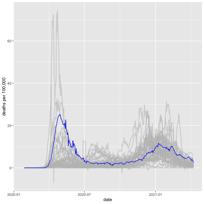
As far as I can tell, there's no generally accepted term for this kind of plot. Putting multiple lines on a line chart is sometimes referred to as a spaghetti line chart. So I'll refer to this as a muted-spaghetti chart.
In R it's pretty easy to plot this, the key is to plot another geom_line
with a different data source as the primary line we're looking at.
death_pp %>%
    filter(state == "MA") %>%
    ggplot(aes(date, death_pm_rm)) +
    labs(y = "deaths per 100,000") +
    geom_line(data = death_pp, aes(group = state), color = "grey", size = 1, alpha = 0.5) +
    geom_line(aes(y = death_pm_rm), color = "blue")
Note that I plot the background before the foreground line to ensure the foreground line pops clearly on top.
Doing this with a grid (facets)
Showing this with one state is good, but it's often useful to be able
to look at several states in this way. ggplot2 provides the very nifty
facet_wrap command to plot a line chart for every value in a set, but it
requires a little trickery to make it work with a muted-spaghetti
background like this.
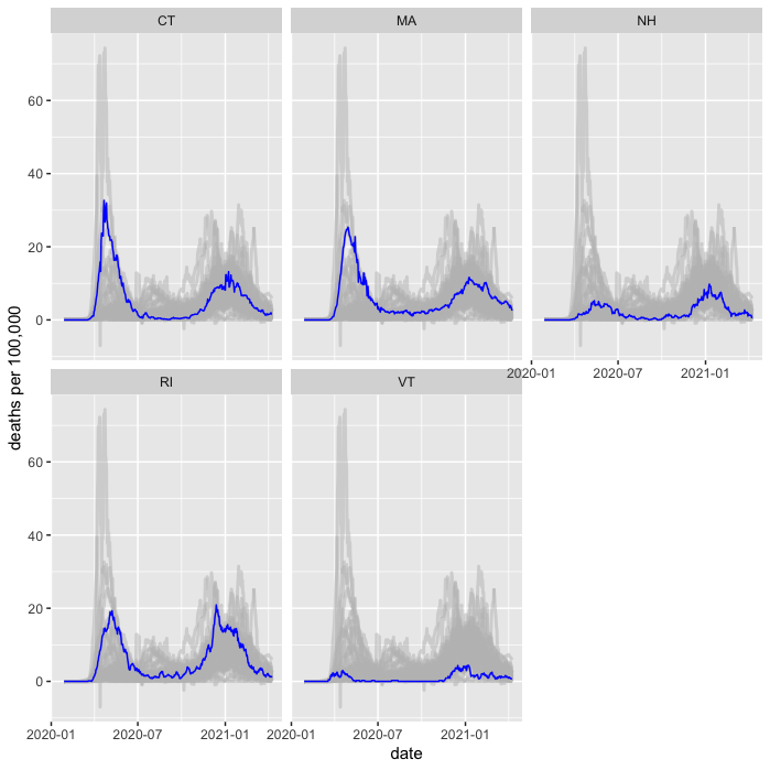
The trickery comes with the way I need to specify the grouping for the spaghetti.
death_pp %>%
  filter(state %in% c("MA", "VT", "CT", "RI", "NH")) %>%
  ggplot(aes(date, death_pm_rm)) +
  labs(y = "deaths per 100,000") +
  geom_line(data = death_pp %>% rename(s = state),
              aes(group = s), color = "grey", size = 1, alpha = 0.5) +
  geom_line(color = "blue") +
  facet_wrap(~state, ncol = 3)
By renaming the grouping column, ggplot only facets the primary line and plots the spaghetti on each facet. 1
1: It took me ages of experimenting and web searching to find how to do this with facets. Eventually I found the answer at from data to viz
Footnotes
1: It took me ages of experimenting and web searching to find how to do this with facets. Eventually I found the answer at from data to viz